University of Tennessee: Tradition and history are celebrated in this Big Orange keepsake.
Background: Neyland Stadium is one of the grandest football cathedrals in all of sports and home to the storied Tennessee Volunteers. The university wanted to commemorate both by compiling their history into a cherished coffee-table book for the rabid fans of the orange and white.
Approach: Neyland: Life of a Stadium not only relays stories of legendary coaches and players, but it also portrays the rituals and razzmatazz that make any given Neyland Saturday such an unforgettable game-day event. The goal was to make every spread a feast for the eyes while transporting the reader deeply into the traditions that make the university great. As a result, this richly illustrated volume exceeded all expectations by selling out two printings in a matter of a few short weeks.
University Size: 37,500 students, faculty and staff
National Building: Constructing a world-class brand from the ground up
Background: National Building, founded in 1964, is a general contractor specializing in commercial and institutional design/build projects. The task was to take an outdated, stale brand and signal a fresh change in ownership and vision.
Approach: After performing a “design audit” on the old identity, we discovered there was no real equity to build upon for the new brand. Therefore, with a clean slate, we could take full advantage of their new strategic vision — to take an “owner’s perspective” in all phases of the process. The dimensionality of the new logo causes the viewer to wonder if they are inspecting the mark from above or below. The colors were chosen to reflect the firm’s earth-friendly construction principles. The overall brand language for the firm is clean, fresh, precise and contemporary — a vast departure from anyone else in their market segment.
Company Size: 15 employees
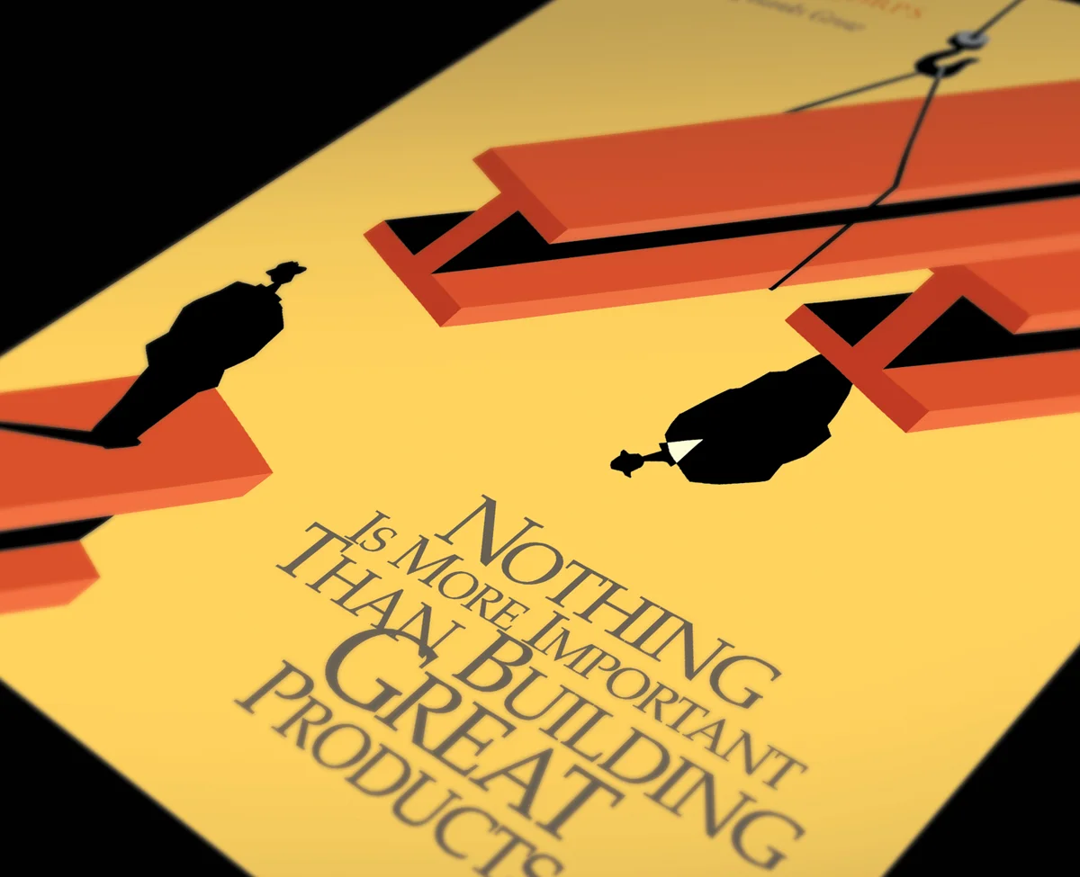
PrintWorks: Soaring past its competition with super-human speed
Background: PrintWorks is a pre-press and printing brokerage firm. Their target market is ad agencies, design firms and in-house art departments. There’s never enough time in the day for this overworked demographic. That’s where PrintWorks comes in. They are able to take print jobs and move them through the various steps to completion with extraordinary speed and efficiency.
Approach: Keeping this highly creative target audience in mind, the solution had to be bold and in your face. The fact that PrintWorks is able to take a great deal of work and stress off of its clients often casts them in the role of superhero. The brand capitalizes on that visual metaphor in its use of bold color and comic book-style graphics. The positioning line developed for the company is “From disk to delivery... in a single bound.”
Company Size: 3 employees
Black Ink: Keeping the client out of the red and swimming in the black
Background: Black Ink is a retail consulting firm. They have the ability to analyze sales data and inventory reports in such a way that allows their customers to more accurately predict buying patterns, manage inventories and avoid costly merchandise mark-downs — thus increasing cash flow and profitability. The target demographic was young urban professionals in their late 20s to early 40s.
Approach: The name Black Ink is simply perfect for the retail consulting industry. It’s exactly what their clientele continually aspires to. The design solution centered around an influx of black ink, which is being graphed to reveal ever-increasing profits. The positioning line developed is “Are you operating in the Black?”. The logo is naturally a splatter of ink. Simple, yet quirky photographic compositions were also created to help drive home key sales points. The overall resulting brand is both dynamic and edgy — the perfect complement to the perfect name.
Company Size: 120 employees
Investors Equity Holdings: Investing in a new brand pays big dividends.
Background: Investors Equity Holdings is a small investment company that sells limited partnership interests in a select number of prime commercial real estate properties. The task was to create a brand that would quickly elevate them to a level on par with their much larger competitors, and in turn gain them more market credibility — allowing them to more aggressively seek the large sums of investment dollars necessary to subsidize their varied projects.
Approach: Cash is king in the investment world. Our brand solution revolved around the iconic typography and graphics found in U.S. currency and stock certificates. The logo is actually an adaptation of the art found on the one dollar bill. The intricacy and elegance of the custom elements, the personable photo portraits and the clean, contemporary direction of the design perfectly positioned the firm to appeal to the wealthy investors they were seeking.
Company Size: 18 employees
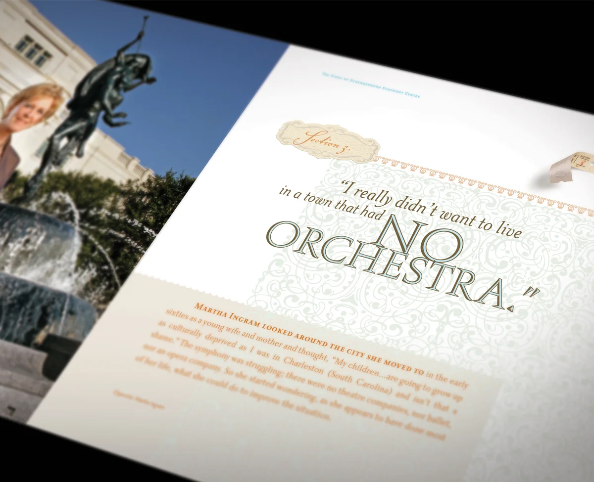
Nashville Symphony: Virtuoso performances are revealed at every turn of the page.
Background: When the Nashville Symphony embarked on the monumental task of building their new symphony hall, they knew it had to be chronicled in a commemorative book—every step, from concept to finish. This new facility was destined to become one of the most acoustically perfect symphony centers the world has ever seen. The book had to ascend to that lofty stature.
Approach: The juxtaposition of the grit involved in the construction process with the elegance of classical music was very intriguing. The precision necessary for each endeavor made the comparison not only acceptable, but welcomed. The book takes the reader through every phase of the project, from its conception on a paper napkin to the architectural firm’s sketches and models; from the ground breaking to the acrobatic workers on steel girders; from the finishing touches to the triumphant opening night. The book is an unprecedented glimpse into the creation of a true cultural landmark.
Company Size: 190 employees
Cummins Station: High energy defines this uniquely eclectic office community.
Background: Cummins Station was originally a train station/warehouse space built in 1907 in downtown Nashville. It now serves as some of the most unique office space available in the city. The owner of the property has painstakingly developed a culture of community throughout the facility by leasing to a wide variety of tenants who have all come to rely on each other’s services. Interestingly, the individual office spaces in this historic building have a decidedly contemporary feel. Our task was to create a small softbound book to commemorate the property’s 100 year anniversary.
Approach: First and foremost, we had to capture the energy that is exuded at Cummins Station. Our solution utilizes an abundance of artistically shot photography married with heavily layered graphics and typography to create a sense of vitality and excitement. Tenant profiles were also included. The resulting design was so well received that we were asked to help perpetuate this new brand language across all of the property’s marketing endeavors.
Company Size: 30 employees
StrategyCorps: A conceptual spin breathes fresh air into a conservative market.
Background: StrategyCorps is in the business of consulting with banks across the U.S. to help make their checking account packages more profitable while increasing the satisfaction level of their customers. Since the company’s inception in 2001, they have become a leader in the financial products industry.
Approach: We were brought in on the ground floor of this new business endeavor. It quickly became evident that we needed to make a splash in the marketplace... to do things differently than StrategyCorps’ competitors. Our brand strategy was to steer clear of the traditional “stuffed shirt” approach that had become so ingrained in and synonymous with the financial industry. Highly conceptual illustrations were created by a nationally renowned artist which helped drive home the sales points; a bold new color scheme emerged that cut through the clutter; a new brand language was defined that enabled StrategyCorps to speak to their target audience in a fresh new way—all contributing to the firm’s meteoric rise to success.
Company Size: 45 employees
Nashville Aquatic Club: A Nashville icon makes a big splash with an olympic-sized rebrand.
Background: NAC is the premier year round competitive swim program in Middle Tennessee. Since its inception in 1975, they have trained tens of thousands of children of all skill levels—including olympians—to maximize their potential. Their old brand simply wasn’t worthy of their exemplary reputation.
Approach: NAC’s iconic stopwatch logo desperately needed to be refreshed. To further separate the organization from a growing list of competitors, five new illustrations were created depicting the four major swim strokes as well as the moment of victory. The positioning line, “Set Your Sights On Gold,” was crafted to be the motivation for all endeavors. These tools became the cornerstone to transforming the 145,000 square foot facility, marketing materials and web presence into a memorable user experience. NAC has since seen enough growth to necessitate the opening of a second training facility in South Nashville.
Organization Size: 750 staff, coaches and athletes
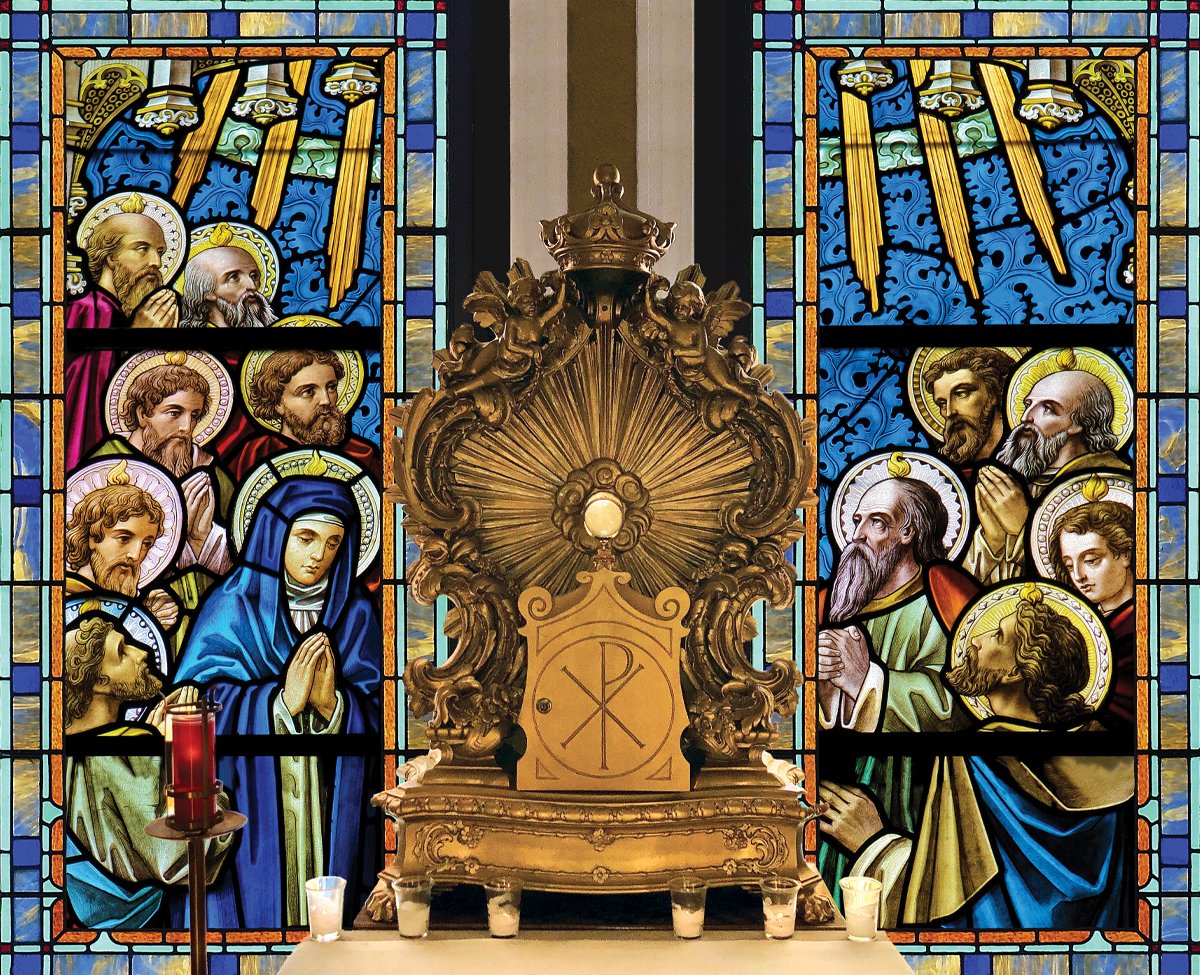
University Catholic: A mission of proposing Jesus Christ and forming His disciples
Background: University Catholic is a ministry of the Diocese of Nashville. It began on the campus of Vanderbilt University in 2005. UCat unites their peers in fellowship and authentic friendship as they deepen their personal relationship with Jesus Christ. For years it maintained a modest presence, meeting the spiritual needs of a small group of college-aged students.
Approach: In 2019, the organization rededicated itself to expanding its reach. A top to bottom rebrand was instituted, giving a more polished and consistent look to all of its communications. UCat’s home base of Frassati House, including the Adoration chapel was renovated to bring a new level of faithful inspiration. The result has been extraordinary growth to more than ten campuses throughout middle Tennessee with more on the way, all in an effort to help countless young adults keep the faith.
Organization Size: Approximately 1,000 staff, leaders and students


